BRAND IDENTITY DESIGN / BRAND EXPRESSION SYSTEM / PRODUCT PACKAGING DESIGN / WEBSITE UX AND UI DESIGN / MARKETING GUIDANCE
D2C medicinal mushroom company branding case study
Project background: Based out of Gwalior, Madhya Pradesh, Myco Forest is a gourmet and medicinal mushroom cultivation and distribution company with the objective of bringing the myriad of nutritional, medicinal, and philosophical benefits of this relatively unknown species to the people of this world. They currently grow high-quality Cordyceps Militaris mushrooms in a controlled atmosphere with a full vegan process that uses brown rice, glucose, vegetable proteins, vitamins, etc. The founder, Mr. Anurag Yadav, approached Arabella Design to help with the company’s branding. The brief was to design a health-boosting brand image that resonated with the medicinal mushroom’s nutritious supplements.
Brand identity design: Myco Forest
Look and feel: Energetic, organic, natural, and professional.
The visual identity was designed to give the brand a sense of power, which was achieved through the bright orange tone. The overlapping mushrooms of different characteristic shapes were designed to create a visualization of the forest. The wave-like graphic elements were designed to symbolize energy flowing through blood vessels / DNA / biology. The Mushroom Startup Branding was also done with the primary objective to reflect that Myco Forest deals with all kinds of mushroom varieties.
Logo exclusion zone
The exclusion zone is the designed clear space that ensures that the logo has some breathing space around it. It is to ensure that the logo is always visually distinct. For both logo orientations, the exclusion zone was kept equal to the head height of the smallest mushroom (as depicted in the image). The exclusions generic rules were designed for third-party vendors and creative advertisement agencies. These do not apply to business collateral and product packaging designs.
Brand expression system
A crucial ingredient in a food brand, the below set of fonts was recommended to evoke the emotions of energy and good health and showcase the brand's best side,i.e., Top Quality Medicinal Mushrooms. The choice of text style was recommended to have a huge impact on the 'feel' of the business and to connect consumers to the very core of the brand.
The recommended brand color palette was chosen to communicate the desired energetic look and feel of the mushroom brand.
Minimum size
The minimum sizes were recommended to ensure that the brand’s visibility and legibility are never compromised.
80 px / 16 mm
165 px / 30 mm
Product packaging design
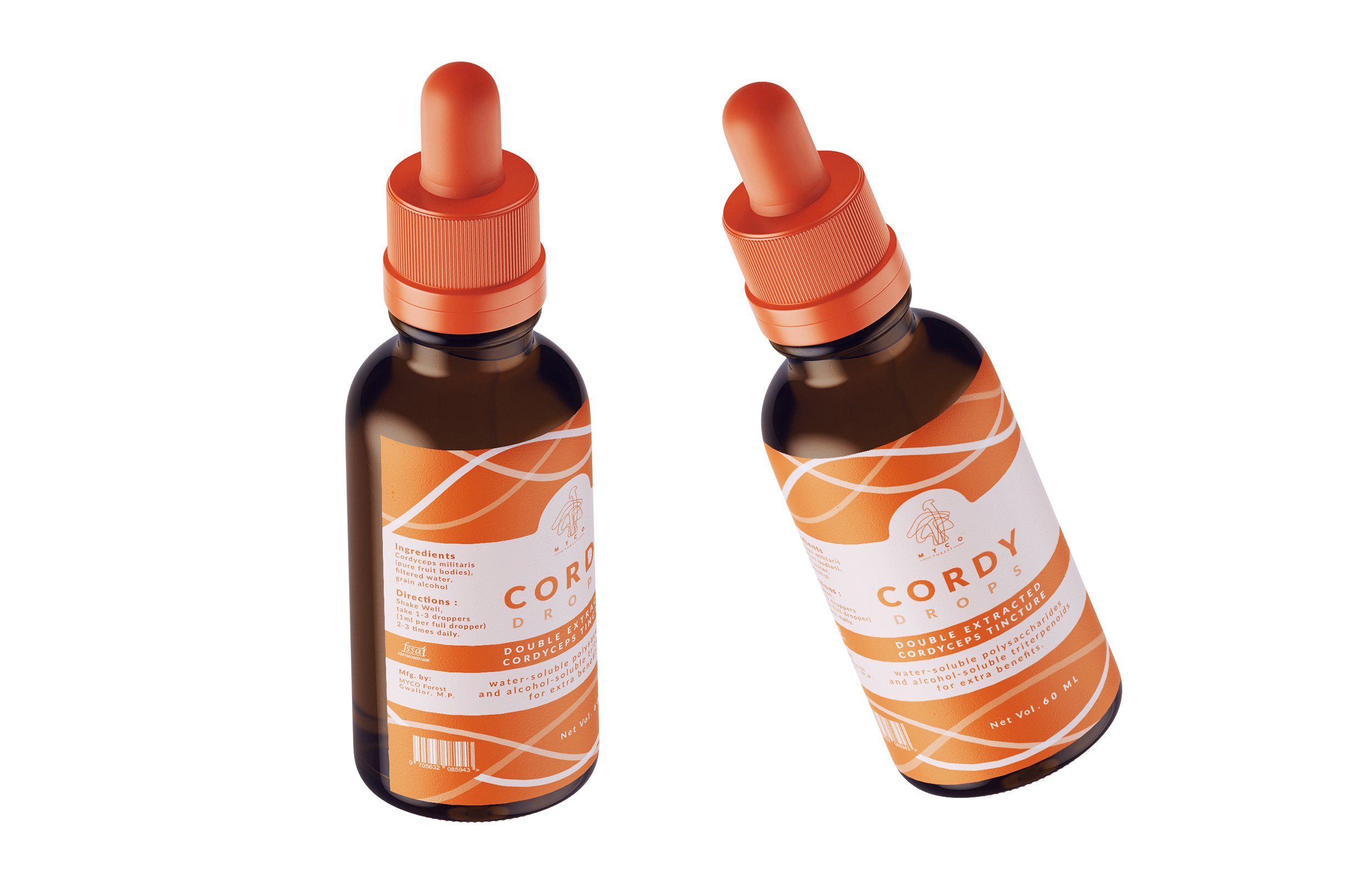
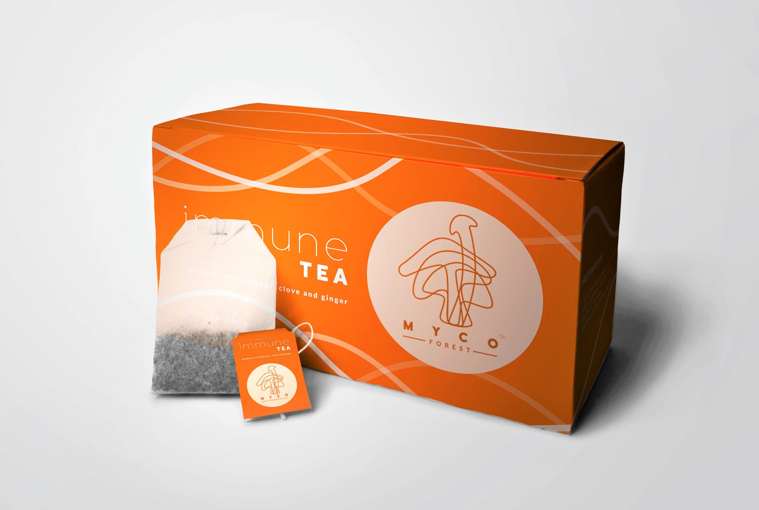
It is the design of the packaging that builds up the value of the product inside. We used design as a tool to increase the product’s value and enhance the brand’s image. Our packaging was designed to outshine the brand’s competition, generate trust, and persuade shoppers to purchase the offerings. The unique wavy pattern was designed to visually represent and connect the high-energy feel with our products. The pattern also subconsciously relates to the veins and arteries in our body, generating a feel that it will transform the body from within.


Brand website UX & UI design
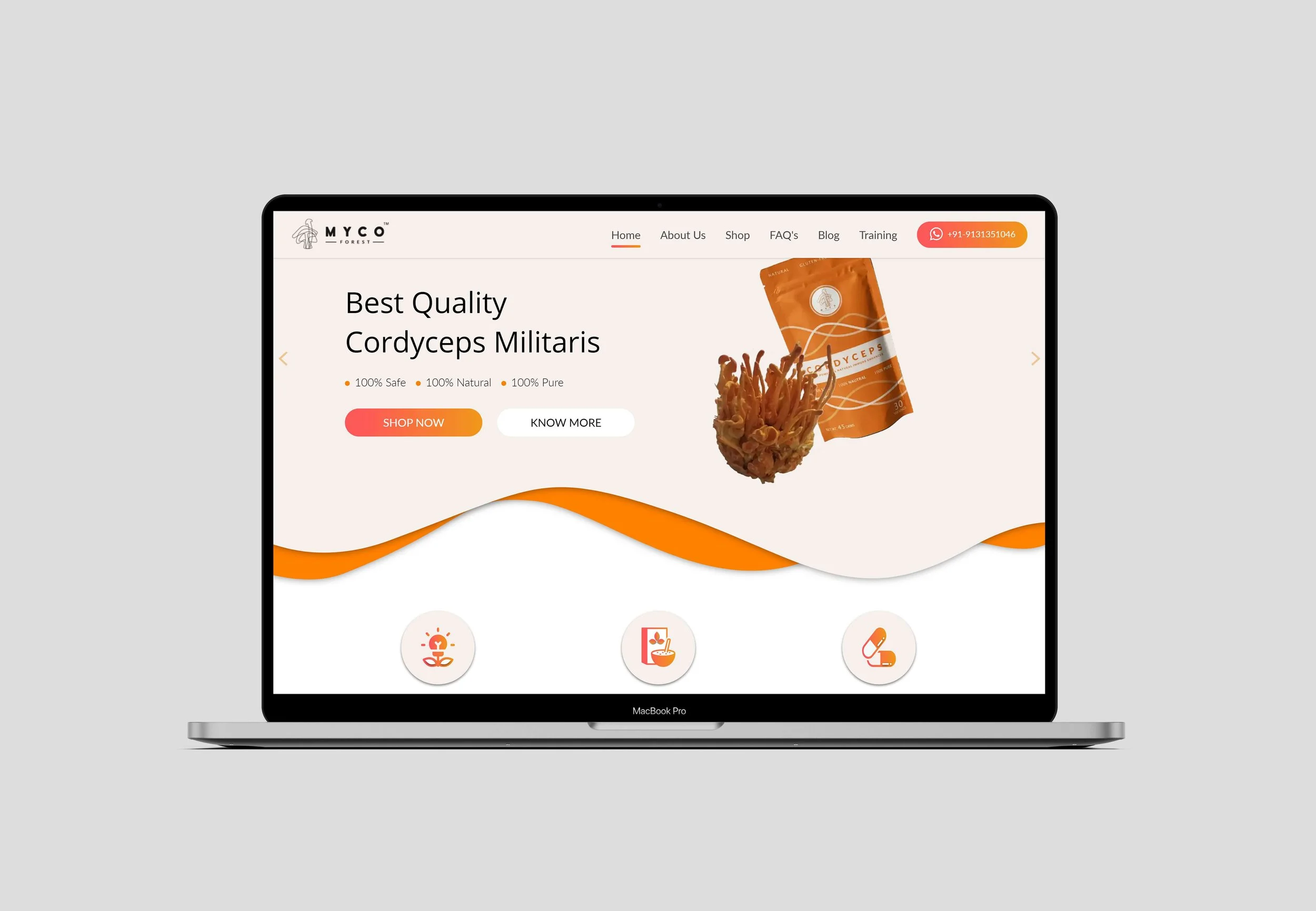
Website is the backbone of any business’s online presence. We helped the brand build memorable, conversion-focused, and future-proofed website and e-commerce store, reinforcing and increasing brand value and customer loyalty.
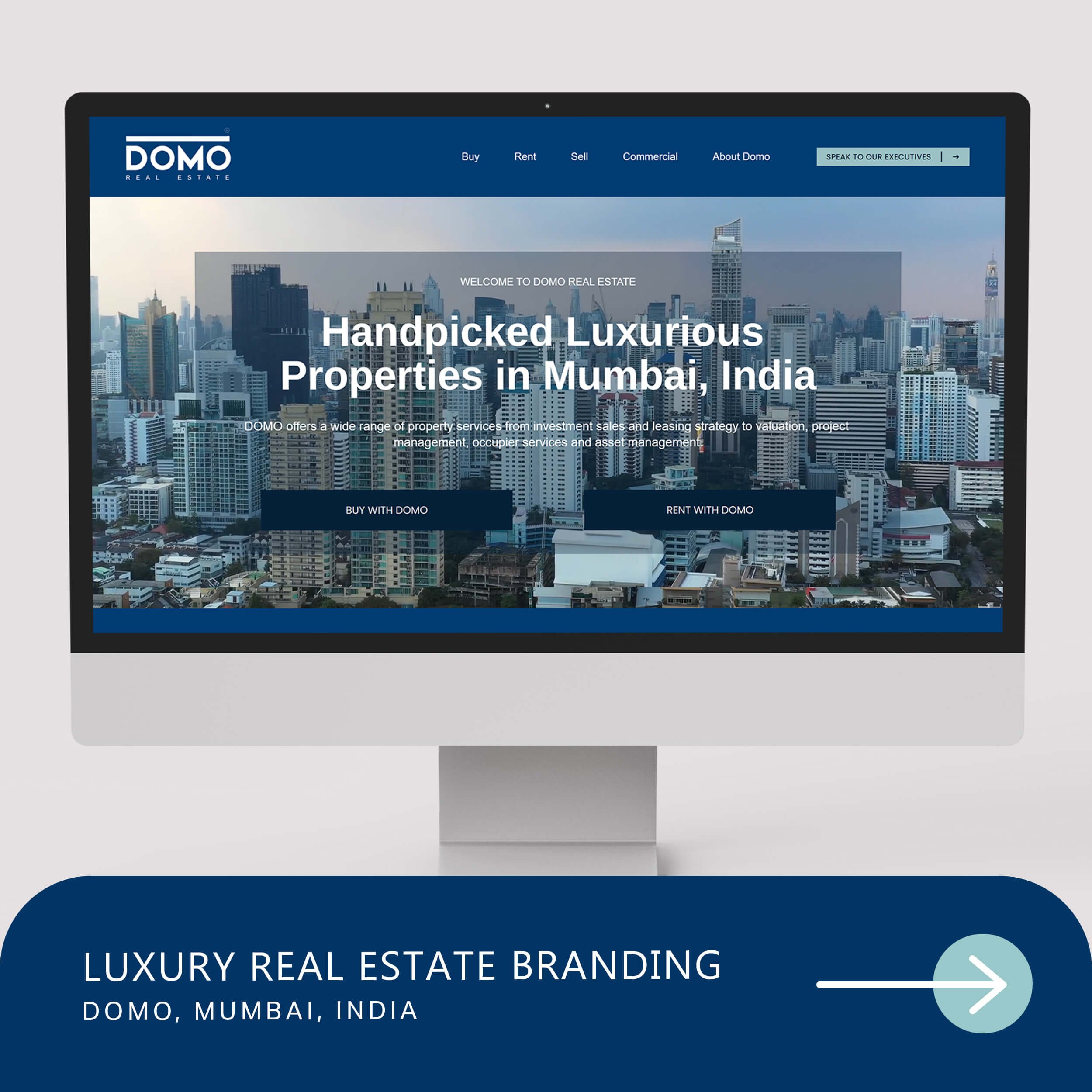
EXPLORE SOME OTHER LATEST WORK
Case studies of some other brands we’ve built.
Branding is at the core of everything we do. Every design, every detail, every decision — all purposefully crafted to strengthen the brand. Our outcome-focused solutions span research, strategy, creativity, engagement, and execution.


