BRAND IDENTITY / BRAND EXPRESSION SYSTEM / BRAND STATIONERY DESIGN / PRODUCT PACKAGING / STORE BRANDING / BRAND GUIDELINES AND MARKETING CAMPAIGN DESIGN
B2C unisex everyday clothing branding case study
Project background: Based out of San Francisco, USA, the startup aims at revolutionizing the fashion industry through its unique approach to abstract designs. The team approached Arabella Design to design a brand that is associated with unconventional thinking and great color combinations. The business has a vision of making modern unisex garments that are colorful and fun.
Brand identity design
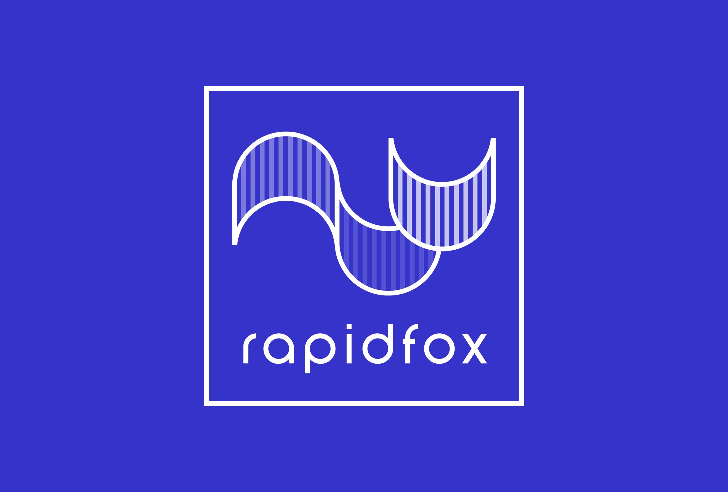
The logo is new and unique to the eye. Made using a single repetitive pattern, the logo graphic was designed to represent a fox. The 3D wavy feel in the logo resembles a running fox and the folds of cloth, bringing alive the unconventional and energetic look of the unisex clothing startup branding identity. The horizontal version has been designed to have no box surrounding it. The logo design has been featured in “The Best Logo Designs That Make Lasting Impressions by DesignRush”. To know more read here.
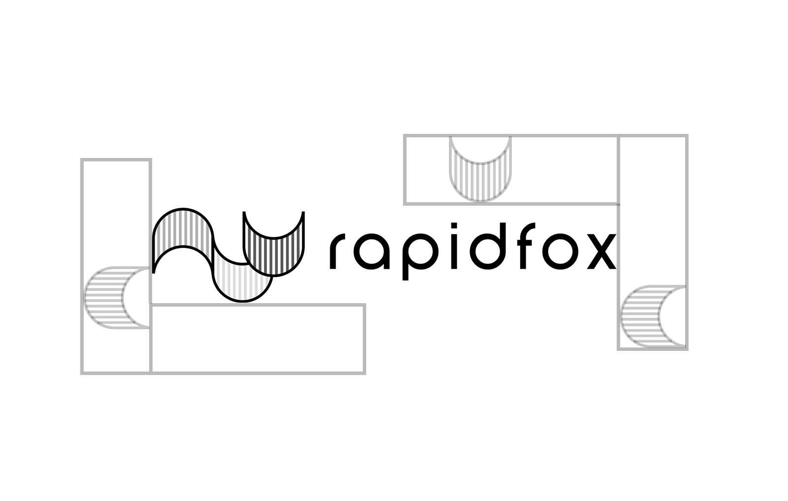
Logo exclusion zone
The exclusion zone is the designed clear space that ensures that the logo has some breathing space around it. It is to ensure that the logo is always visually distinct. Different exclusion zones were recommended for both variants of the identities. These exclusion rules were designed keeping in mind the future placements of the logo on various surfaces. These do not apply to the clothing branding assets or collateral.


Expression system
The brand color palette and brand typography system were recommended to go along with the brand archetype and the desired look and feel.
Shopping bag branding
The communication was designed to keep it clean with a direct focus only on the brand tagline. Solid brand-colored backgrounds were recommended to make it visually more eye-catching and to help register the brand identity in the shopper’s mind.
On-fabric rubber branding
The brand wanted to come across as a minimal brand offering solid/plain-colored garments only and with no commercial graphic variants. We hence recommended a 3D rubber printed brand logo on solid colors to make the garments more appealing and attractive.


Garment label, tag & packaging Design
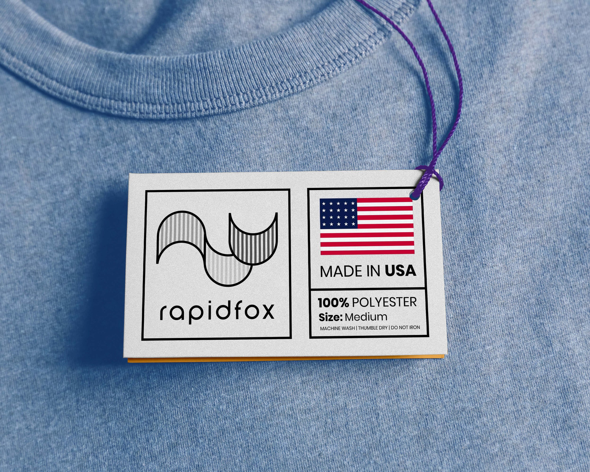
A high-quality branded swing tag was designed to add to the product’s credibility and ensure that the customers understand that the product is of the same standard.


Store Facade Branding
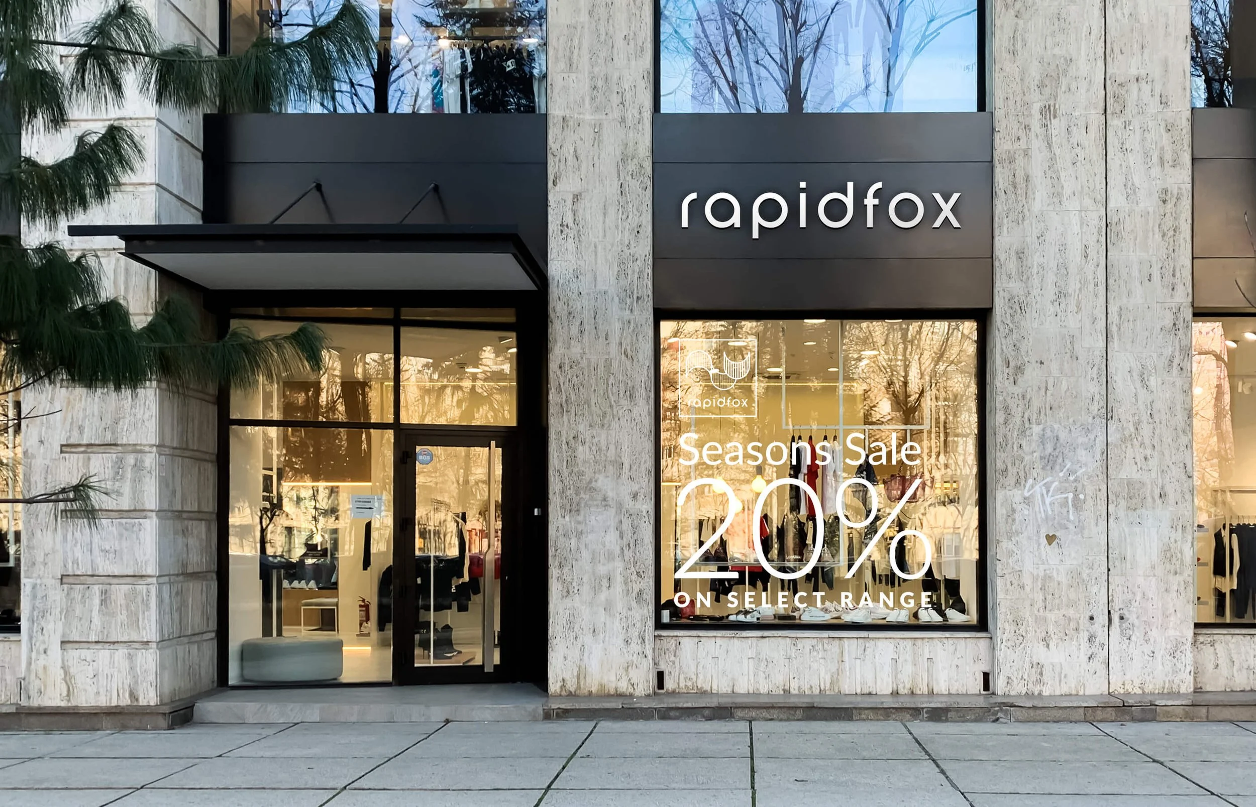
The facade was designed to grab attention.
The wordmark type of the logo was used instead of the logo icon so that it becomes clear at a glance and the brand name stands out. The design was kept minimal to offer the customers the opportunity to connect and associate themselves with the brand’s personality and unique style.
EXPLORE SOME OTHER LATEST WORK
Case studies of some other brands we’ve built.
Branding is at the core of everything we do. Every design, every detail, every decision — all purposefully crafted to strengthen the brand. Our outcome-focused solutions span research, strategy, creativity, engagement, and execution.


